Cross Spectra
This tutorial shows how to make and manipulate a cross spectrum of two light curves using Stingray.
[1]:
import numpy as np
from stingray import Lightcurve, Crossspectrum, AveragedCrossspectrum

import matplotlib.pyplot as plt
import matplotlib.font_manager as font_manager
%matplotlib inline
font_prop = font_manager.FontProperties(size=16)
1. Create two light curves
There are two ways to make Lightcurve objects. We’ll show one way here. Check out “Lightcurve/Lightcurve tutorial.ipynb” for more examples.
Generate an array of relative timestamps that’s 8 seconds long, with dt = 0.03125 s, and make two signals in units of counts. The first is a sine wave with amplitude = 300 cts/s, frequency = 2 Hz, phase offset = 0 radians, and mean = 1000 cts/s. The second is a sine wave with amplitude = 200 cts/s, frequency = 2 Hz, phase offset = pi/4 radians, and mean = 900 cts/s. We then add Poisson noise to the light curves.
[2]:
dt = 0.03125  # seconds
exposure = 8.  # seconds
times = np.arange(0, exposure, dt)  # seconds

signal_1 = 300 * np.sin(2.*np.pi*times/0.5) + 1000  # counts/s
signal_2 = 200 * np.sin(2.*np.pi*times/0.5 + np.pi/4) + 900  # counts/s
noisy_1 = np.random.poisson(signal_1*dt)  # counts
noisy_2 = np.random.poisson(signal_2*dt)  # counts
Now let’s turn noisy_1 and noisy_2 into Lightcurve objects.
[3]:
lc1 = Lightcurve(times, noisy_1)
lc2 = Lightcurve(times, noisy_2)
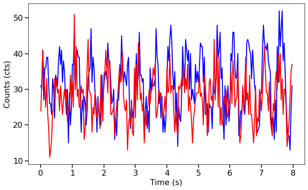
Here we’re plotting them to see what they look like.
[4]:
fig, ax = plt.subplots(1,1,figsize=(10,6))
ax.plot(lc1.time, lc1.counts, lw=2, color='blue')
ax.plot(lc1.time, lc2.counts, lw=2, color='red')
ax.set_xlabel("Time (s)", fontproperties=font_prop)
ax.set_ylabel("Counts (cts)", fontproperties=font_prop)
ax.tick_params(axis='x', labelsize=16)
ax.tick_params(axis='y', labelsize=16)
ax.tick_params(which='major', width=1.5, length=7)
ax.tick_params(which='minor', width=1.5, length=4)
plt.show()
2. Pass both of the light curves to the Crossspectrum class to create a Crossspectrum object.
The first Lightcurve passed is the channel of interest or interest band, and the second Lightcurve passed is the reference band. You can also specify the optional attribute norm if you wish to normalize the real part of the cross spectrum to squared fractional rms, Leahy, or squared absolute normalization. The default normalization is ‘frac’.
[5]:
cs = Crossspectrum.from_lightcurve(lc1, lc2)
print(cs)
<stingray.crossspectrum.Crossspectrum object at 0x7f7aa3d518b0>
Note that, in principle, the Crossspectrum object could have been initialized directly as
ps = Crossspectrum(lc1, lc2, norm="leahy")
However, we recommend using the specific method for input light curve objects used above, for clarity. Equivalently, one can initialize a Crossspectrum object:
from
EventListobjects asbin_time = 0.1 ps = Crossspectrum.from_events(events1, events2, dt=bin_time, norm="leahy")
where the light curves, uniformly binned at 0.1 s, are created internally.
from
numpyarrays of times, asbin_time = 0.1 ps = Crossspectrum.from_events(times1, times2, dt=bin_time, gti=[[t0, t1], [t2, t3], ...], norm="leahy")
where the light curves, uniformly binned at 0.1 s in this case, are created internally, and the good time intervals (time interval where the instrument was collecting data nominally) are passed by hand. Note that the frequencies of the cross spectrum will be expressed in inverse units as the input time arrays. If the times are expressed in seconds, frequencies will be in Hz; with times in days, frequencies will be in 1/d, and so on. We do not support units (e.g.
astropyunits) yet, so the user should pay attention to these details.from an iterable of light curves
ps = Crossspectrum.from_lc_iter(lc_iterable1, lc_iterable2, dt=bin_time, norm="leahy")
where
lc_iterableXis any iterable ofLightcurveobjects (list, tuple, generator, etc.) anddtis the sampling time of the light curves. Note that thisdtis needed because the iterables might be generators, in which case the light curves are lazy-loaded after a bunch of operations using dt have been done.
We can print the first five values in the arrays of the positive Fourier frequencies and the cross power. The cross power has a real and an imaginary component.
[6]:
print(cs.freq[0:5])
print(cs.power[0:5])
[0.125 0.25  0.375 0.5   0.625]
[-3264.54599394-1077.46450232j  1066.6390401 -2783.16358879j
  3275.00416926 +196.64355198j -8345.12445869-6661.52326503j
  5916.3705245 +3602.05210672j]
Since the negative Fourier frequencies (and their associated cross powers) are discarded, the number of time bins per segment n is twice the length of freq and power.
[7]:
print("Size of positive Fourier frequencies: %d" % len(cs.freq))
print("Number of data points per segment: %d" % cs.n)
Size of positive Fourier frequencies: 127
Number of data points per segment: 256
Properties
A Crossspectrum object has the following properties :
freq: Numpy array of mid-bin frequencies that the Fourier transform samples.power: Numpy array of the cross spectrum (complex numbers).df: The frequency resolution.m: The number of cross spectra averaged together. For aCrossspectrumof a single segment,m=1.n: The number of data points (time bins) in one segment of the light curves.nphots1: The total number of photons in the first (interest) light curve.nphots2: The total number of photons in the second (reference) light curve.
We can compute the amplitude of the cross spectrum, and plot it as a function of Fourier frequency. Notice how there’s a spike at our signal frequency of 2 Hz!
[8]:
cs_amplitude = np.abs(cs.power)  # The mod square of the real and imaginary components

fig, ax1 = plt.subplots(1,1,figsize=(9,6), sharex=True)
ax1.plot(cs.freq, cs_amplitude, lw=2, color='blue')
ax1.set_xlabel("Frequency (Hz)", fontproperties=font_prop)
ax1.set_ylabel("Cross spectral amplitude", fontproperties=font_prop)
ax1.set_yscale('log')
ax1.tick_params(axis='x', labelsize=16)
ax1.tick_params(axis='y', labelsize=16)
ax1.tick_params(which='major', width=1.5, length=7)
ax1.tick_params(which='minor', width=1.5, length=4)
for axis in ['top', 'bottom', 'left', 'right']:
    ax1.spines[axis].set_linewidth(1.5)
plt.show()
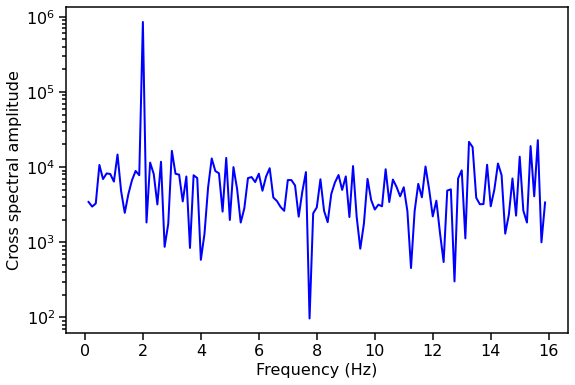
You’ll notice that the cross spectrum is a bit noisy. This is because we’re only using one segment of data. Let’s try averaging together multiple segments of data. # Averaged cross spectrum example You could use two long Lightcurves and have AveragedCrossspectrum chop them into specified segments, or give two lists of Lightcurves where each segment of Lightcurve is the same length. We’ll show the first way here. Remember to check the Lightcurve tutorial notebook for fancier
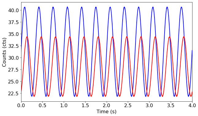
ways of making light curves. ## 1. Create two long light curves. Generate an array of relative timestamps that’s 1600 seconds long, and two signals in count rate units, with the same properties as the previous example. We then add Poisson noise and turn them into Lightcurve objects.
[9]:
long_dt = 0.03125 # seconds
long_exposure = 1600. # seconds
long_times = np.arange(0, long_exposure, long_dt) # seconds
# In count rate units here
long_signal_1 = 300 * np.sin(2.*np.pi*long_times/0.5) + 1000 # counts/s
long_signal_2 = 200 * np.sin(2.*np.pi*long_times/0.5 + np.pi/4) + 900 # counts/s
# Multiply by dt to get count units, then add Poisson noise
long_noisy_1 = np.random.poisson(long_signal_1*dt) # counts
long_noisy_2 = np.random.poisson(long_signal_2*dt) # counts
long_lc1 = Lightcurve(long_times, long_noisy_1)
long_lc2 = Lightcurve(long_times, long_noisy_2)
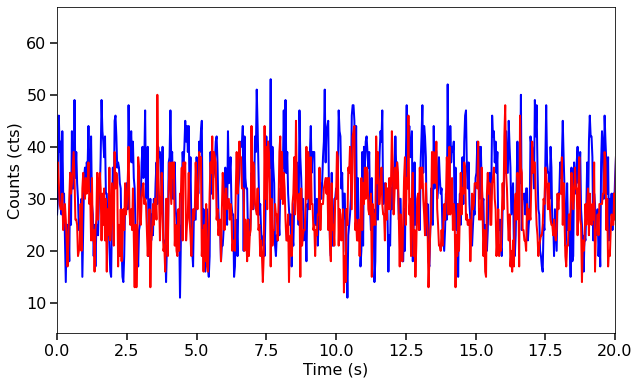
fig, ax = plt.subplots(1,1,figsize=(10,6))
ax.plot(long_lc1.time, long_lc1.counts, lw=2, color='blue')
ax.plot(long_lc1.time, long_lc2.counts, lw=2, color='red')
ax.set_xlim(0,20)
ax.set_xlabel("Time (s)", fontproperties=font_prop)
ax.set_ylabel("Counts (cts)", fontproperties=font_prop)
ax.tick_params(axis='x', labelsize=16)
ax.tick_params(axis='y', labelsize=16)
ax.tick_params(which='major', width=1.5, length=7)
ax.tick_params(which='minor', width=1.5, length=4)
plt.show()
2. Pass both light curves to the AveragedCrossspectrum class with a specified segment_size.
If the exposure (length) of the light curve cannot be divided by segment_size with a remainder of zero, the last incomplete segment is thrown out, to avoid signal artefacts. Here we’re using 8 second segments.
[10]:
avg_cs = AveragedCrossspectrum.from_lightcurve(long_lc1, long_lc2, 8.)
200it [00:00, 12346.54it/s]
Note that also the AveragedCrossspectrum object could have been initialized using different input types:
from
EventListobjects asbin_time = 0.1 ps = AveragedCrossspectrum.from_events( events1, events2, dt=bin_time, segment_size=segment_size, norm="leahy")(note, again, the necessity of the bin time)
from
numpyarrays of times, asbin_time = 0.1 ps = AveragedCrossspectrum.from_events( times1, times2, dt=bin_time, segment_size=segment_size, gti=[[t0, t1], [t2, t3], ...], norm="leahy")where the light curves, uniformly binned at 0.1 s in this case, are created internally, and the good time intervals (time interval where the instrument was collecting data nominally) are passed by hand. Note that the frequencies of the cross spectrum will be expressed in inverse units as the input time arrays. If the times are expressed in seconds, frequencies will be in Hz; with times in days, frequencies will be in 1/d, and so on. We do not support units (e.g.
astropyunits) yet, so the user should pay attention to these details.from iterables of light curves
ps = AveragedCrossspectrum.from_lc_iter(
    lc_iterable1, lc_iterable2, dt=bin_time, segment_size=segment_size,
    norm="leahy")
where
lc_iterableXis any iterable ofLightcurveobjects (list, tuple, generator, etc.) anddtis the sampling time of the light curves. Note that thisdtis needed because the iterables might be generators, in which case the light curves are lazy-loaded after a bunch of operations using dt have been done.
Again we can print the first five Fourier frequencies and first five cross spectral values, as well as the number of segments.
[11]:
print(avg_cs.freq[0:5])
print(avg_cs.power[0:5])
print("\nNumber of segments: %d" % avg_cs.m)
[0.125 0.25  0.375 0.5   0.625]
[291.76338464-640.48290689j 182.72485752 -35.81942269j
 293.42490539+276.16187738j 771.98935476-595.89062793j
 361.32859119-101.50371039j]

Number of segments: 200
If m is less than 50 and you try to compute the coherence, a warning will pop up letting you know that your number of segments is significantly low, so the error on coherence might not follow the expected (Gaussian) statistical distributions.
[12]:
test_cs = AveragedCrossspectrum.from_lightcurve(long_lc1, long_lc2, 40.)
print(test_cs.m)
coh, err = test_cs.coherence()
40it [00:00, 7645.47it/s]
40
Properties
An AveragedCrossspectrum object has the following properties, same as Crossspectrum :
freq: Numpy array of mid-bin frequencies that the Fourier transform samples.power: Numpy array of the averaged cross spectrum (complex numbers).df: The frequency resolution (in Hz).m: The number of cross spectra averaged together, equal to the number of whole segments in a light curve.n: The number of data points (time bins) in one segment of the light curves.nphots1: The total number of photons in the first (interest) light curve.nphots2: The total number of photons in the second (reference) light curve.
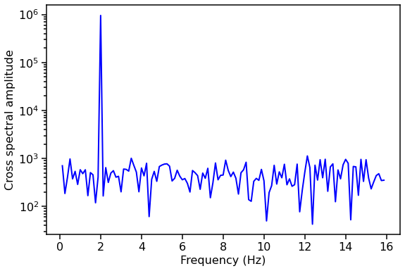
Let’s plot the amplitude of the averaged cross spectrum!
[13]:
avg_cs_amplitude = np.abs(avg_cs.power)

fig, ax1 = plt.subplots(1,1,figsize=(9,6))
ax1.plot(avg_cs.freq, avg_cs_amplitude, lw=2, color='blue')
ax1.set_xlabel("Frequency (Hz)", fontproperties=font_prop)
ax1.set_ylabel("Cross spectral amplitude", fontproperties=font_prop)
ax1.set_yscale('log')
ax1.tick_params(axis='x', labelsize=16)
ax1.tick_params(axis='y', labelsize=16)
ax1.tick_params(which='major', width=1.5, length=7)
ax1.tick_params(which='minor', width=1.5, length=4)
for axis in ['top', 'bottom', 'left', 'right']:
    ax1.spines[axis].set_linewidth(1.5)
plt.show()
Now we’ll show examples of all the things you can do with a Crossspectrum or AveragedCrossspectrum object using built-in stingray methods.
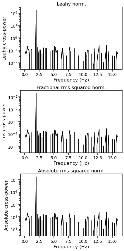
Normalizating the cross spectrum
The three kinds of normalization are: * leahy: Leahy normalization. Makes the Poisson noise level \(= 2\). See Leahy et al. 1983, ApJ, 266, 160L. * frac: Fractional rms-squared normalization, also known as rms normalization. Makes the Poisson noise level \(= 2 / \sqrt(meanrate_1\times meanrate_2)\). See Belloni & Hasinger 1990, A&A, 227, L33, and Miyamoto et al. 1992, ApJ, 391, L21.. This is the default. * abs: Absolute rms-squared normalization, also known as
absolute normalization. Makes the Poisson noise level \(= 2 \times \sqrt(meanrate_1\times meanrate_2)\). See insert citation. * none: No normalization applied.
Note that these normalizations and the Poisson noise levels apply to the “cross power”, not the cross-spectral amplitude.
[14]:
avg_cs_leahy = AveragedCrossspectrum.from_lightcurve(long_lc1, long_lc2, 8., norm='leahy')
avg_cs_frac = AveragedCrossspectrum.from_lightcurve(long_lc1, long_lc2, 8., norm='frac')
avg_cs_abs = AveragedCrossspectrum.from_lightcurve(long_lc1, long_lc2, 8., norm='abs')
200it [00:00, 15141.07it/s]
200it [00:00, 12807.43it/s]
200it [00:00, 13023.36it/s]
Here we plot the three normalized averaged cross spectra.
[15]:
fig, [ax1, ax2, ax3] = plt.subplots(3,1,figsize=(6,12))
ax1.plot(avg_cs_leahy.freq, avg_cs_leahy.power, lw=2, color='black')
ax1.set_xlabel("Frequency (Hz)", fontproperties=font_prop)
ax1.set_ylabel("Leahy cross-power", fontproperties=font_prop)
ax1.set_yscale('log')
ax1.tick_params(axis='x', labelsize=14)
ax1.tick_params(axis='y', labelsize=14)
ax1.tick_params(which='major', width=1.5, length=7)
ax1.tick_params(which='minor', width=1.5, length=4)
ax1.set_title("Leahy norm.", fontproperties=font_prop)

ax2.plot(avg_cs_frac.freq, avg_cs_frac.power, lw=2, color='black')
ax2.set_xlabel("Frequency (Hz)", fontproperties=font_prop)
ax2.set_ylabel("rms cross-power", fontproperties=font_prop)
ax2.tick_params(axis='x', labelsize=14)
ax2.tick_params(axis='y', labelsize=14)
ax2.set_yscale('log')
ax2.tick_params(which='major', width=1.5, length=7)
ax2.tick_params(which='minor', width=1.5, length=4)
ax2.set_title("Fractional rms-squared norm.", fontproperties=font_prop)

ax3.plot(avg_cs_abs.freq, avg_cs_abs.power, lw=2, color='black')
ax3.set_xlabel("Frequency (Hz)", fontproperties=font_prop)
ax3.set_ylabel("Absolute cross-power", fontproperties=font_prop)
ax3.tick_params(axis='x', labelsize=14)
ax3.tick_params(axis='y', labelsize=14)
ax3.set_yscale('log')
ax3.tick_params(which='major', width=1.5, length=7)
ax3.tick_params(which='minor', width=1.5, length=4)
ax3.set_title("Absolute rms-squared norm.", fontproperties=font_prop)

for axis in ['top', 'bottom', 'left', 'right']:
    ax1.spines[axis].set_linewidth(1.5)
    ax2.spines[axis].set_linewidth(1.5)
    ax3.spines[axis].set_linewidth(1.5)
plt.tight_layout()
plt.show()
Re-binning a cross spectrum in frequency
Typically, rebinning is done on an averaged, normalized cross spectrum. ## 1. We can linearly re-bin a cross spectrum (although this is not done much in practice)
[16]:
print("DF before:", avg_cs.df)
# Both of the following ways are allowed syntax:
# lin_rb_cs = Crossspectrum.rebin(avg_cs, 0.25, method='mean')
lin_rb_cs = avg_cs.rebin(0.25, method='mean')
print("DF after:", lin_rb_cs.df)
DF before: 0.125
DF after: 0.25
2. And we can logarithmically/geometrically re-bin a cross spectrum
In this re-binning, each bin size is 1+f times larger than the previous bin size, where f is user-specified and normally in the range 0.01-0.1. The default value is f=0.01.
Logarithmic rebinning only keeps the real part of the cross spectum.
[17]:
# Both of the following ways are allowed syntax:
# log_rb_cs, log_rb_freq, binning = Crossspectrum.rebin_log(avg_cs, f=0.02)
log_rb_cs = avg_cs.rebin_log(f=0.02)
Note that like rebin, rebin_log returns a Crossspectrum or AveragedCrossspectrum object (depending on the input object):
[18]:
print(type(lin_rb_cs))
<class 'stingray.crossspectrum.AveragedCrossspectrum'>
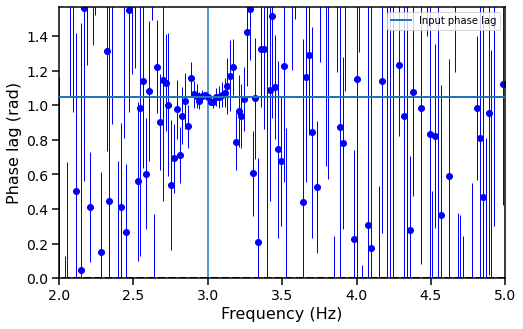
Time lags / phase lags
1. Frequency-dependent lags
The lag-frequency spectrum shows the time lag between two light curves (usually non-overlapping broad energy bands) as a function of Fourier frequency. See Uttley et al. 2014, A&ARev, 22, 72 section 2.2.1.
In AveragedCrossspectrum, the second light curve is what is considered the reference in Uttley et al. and in most other spectral timing literature.
[19]:
long_dt = 0.0015231682473469295763529 # seconds
long_exposure = 1600. # seconds
long_times = np.arange(0, long_exposure, long_dt) # seconds
frequency = 3.
phase_lag = np.pi / 3
# long_signal_1 = 300 * np.sin(2.*np.pi*long_times/0.5) + 100 * np.sin(2.*np.pi*long_times*5 + np.pi/6) + 1000
# long_signal_2 = 200 * np.sin(2.*np.pi*long_times/0.5 + np.pi/4) + 80 * np.sin(2.*np.pi*long_times*5) + 900
long_signal_1 = (300 * np.sin(2.*np.pi*long_times*frequency) + 1000) * dt
long_signal_2 = (200 * np.sin(2.*np.pi*long_times*frequency - phase_lag) + 900) * dt
long_lc1 = Lightcurve(long_times, np.random.normal(long_signal_1, 0.03))
long_lc2 = Lightcurve(long_times, np.random.normal(long_signal_2, 0.03))
# Note: the second light curve is what we use as a reference.
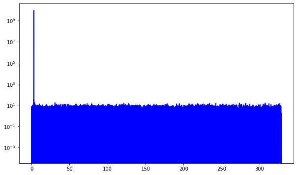
avg_cs = AveragedCrossspectrum.from_lightcurve(long_lc2, long_lc1, 53.)
fig, ax = plt.subplots(1,1,figsize=(10,6))
ax.plot(long_lc1.time, long_lc1.counts, lw=2, color='blue')
ax.plot(long_lc1.time, long_lc2.counts, lw=2, color='red')
ax.set_xlim(0,4)
ax.set_xlabel("Time (s)", fontproperties=font_prop)
ax.set_ylabel("Counts (cts)", fontproperties=font_prop)
ax.tick_params(axis='x', labelsize=16)
ax.tick_params(axis='y', labelsize=16)
plt.show()
fig, ax = plt.subplots(1,1,figsize=(10,6))
ax.plot(avg_cs.freq, avg_cs.power, lw=2, color='blue')
plt.semilogy()
plt.show()
30it [00:00, 264.86it/s]
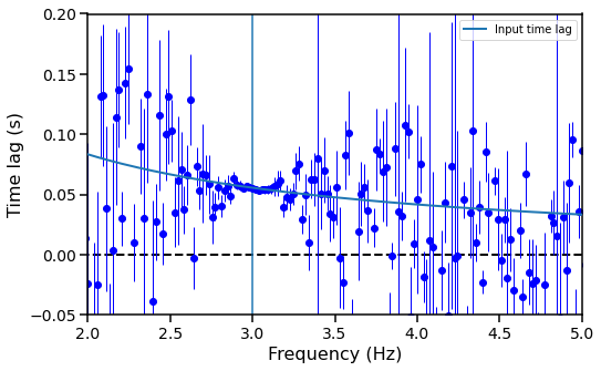
The time_lag method returns an np.ndarray with the time lag in seconds per positive Fourier frequency.
[20]:
freq_lags, freq_lags_err = avg_cs.time_lag()
freq_plags, freq_plags_err = avg_cs.phase_lag()

# Expected time lag, given the input time lag
time_lag = phase_lag / (2. * np.pi * avg_cs.freq)
And this is a plot of the lag-frequency spectrum:
[21]:
fig, ax = plt.subplots(1,1,figsize=(8,5))
ax.hlines(0, avg_cs.freq[0], avg_cs.freq[-1], color='black', linestyle='dashed', lw=2)
ax.errorbar(avg_cs.freq, freq_lags, yerr=freq_lags_err,fmt="o", lw=1, color='blue')
ax.set_xlabel("Frequency (Hz)", fontproperties=font_prop)
ax.set_ylabel("Time lag (s)", fontproperties=font_prop)
ax.tick_params(axis='x', labelsize=14)
ax.tick_params(axis='y', labelsize=14)
ax.tick_params(which='major', width=1.5, length=7)
ax.tick_params(which='minor', width=1.5, length=4)
for axis in ['top', 'bottom', 'left', 'right']:
    ax.spines[axis].set_linewidth(1.5)
# plt.semilogx()
plt.axvline(frequency)
plt.xlim([2, 5])
plt.ylim([-0.05, 0.2])
plt.plot(avg_cs.freq, time_lag, label="Input time lag", lw=2, zorder=10)
plt.legend()
plt.show()
[22]:
fig, ax = plt.subplots(1,1,figsize=(8,5))
ax.hlines(0, avg_cs.freq[0], avg_cs.freq[-1], color='black', linestyle='dashed', lw=2)
ax.errorbar(avg_cs.freq, freq_plags, yerr=freq_plags_err,fmt="o", lw=1, color='blue')
ax.set_xlabel("Frequency (Hz)", fontproperties=font_prop)
ax.set_ylabel("Phase lag (rad)", fontproperties=font_prop)
ax.tick_params(axis='x', labelsize=14)
ax.tick_params(axis='y', labelsize=14)
ax.tick_params(which='major', width=1.5, length=7)
ax.tick_params(which='minor', width=1.5, length=4)
for axis in ['top', 'bottom', 'left', 'right']:
    ax.spines[axis].set_linewidth(1.5)
# plt.semilogx()
plt.axvline(frequency)
plt.xlim([2, 5])
plt.ylim([0, np.pi/ 2])
plt.axhline(phase_lag, label="Input phase lag", lw=2, zorder=10)
plt.legend()
plt.show()
2. Energy-dependent lags
The lag vs energy spectrum can be calculated using the LagEnergySpectrum from stingray.varenergy. Refer to the Spectral Timing documentation.
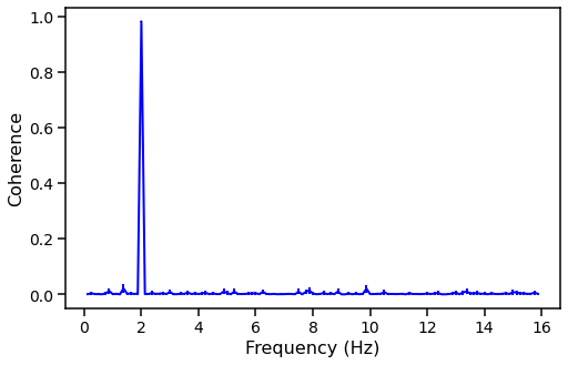
Coherence
Coherence is a Fourier-frequency-dependent measure of the linear correlation between time series measured simultaneously in two energy channels. See Vaughan and Nowak 1997, ApJ, 474, L43 and Uttley et al. 2014, A&ARev, 22, 72 section 2.1.3.
[23]:
long_dt = 0.03125  # seconds
long_exposure = 1600.  # seconds
long_times = np.arange(0, long_exposure, long_dt)  # seconds

long_signal_1 = 300 * np.sin(2.*np.pi*long_times/0.5) + 1000
long_signal_2 = 200 * np.sin(2.*np.pi*long_times/0.5 + np.pi/4) + 900

long_noisy_1 = np.random.poisson(long_signal_1*dt)
long_noisy_2 = np.random.poisson(long_signal_2*dt)

long_lc1 = Lightcurve(long_times, long_noisy_1)
long_lc2 = Lightcurve(long_times, long_noisy_2)

avg_cs = AveragedCrossspectrum.from_lightcurve(long_lc1, long_lc2, 8.)
200it [00:00, 14681.05it/s]
The coherence method returns two np.ndarrays, of the coherence and uncertainty.
[24]:
coh, err_coh = avg_cs.coherence()
The coherence and uncertainty have the same length as the positive Fourier frequencies.
[25]:
print(len(coh) == len(avg_cs.freq))
True
And we can plot the coherence vs the frequency.
[26]:
fig, ax = plt.subplots(1,1,figsize=(8,5))
# ax.hlines(0, avg_cs.freq[0], avg_cs.freq[-1], color='black', linestyle='dashed', lw=2)
ax.errorbar(avg_cs.freq, coh, yerr=err_coh, lw=2, color='blue')
ax.set_xlabel("Frequency (Hz)", fontproperties=font_prop)
ax.set_ylabel("Coherence", fontproperties=font_prop)
ax.tick_params(axis='x', labelsize=14)
ax.tick_params(axis='y', labelsize=14)
ax.tick_params(which='major', width=1.5, length=7)
ax.tick_params(which='minor', width=1.5, length=4)
for axis in ['top', 'bottom', 'left', 'right']:
    ax.spines[axis].set_linewidth(1.5)
plt.show()
[ ]: